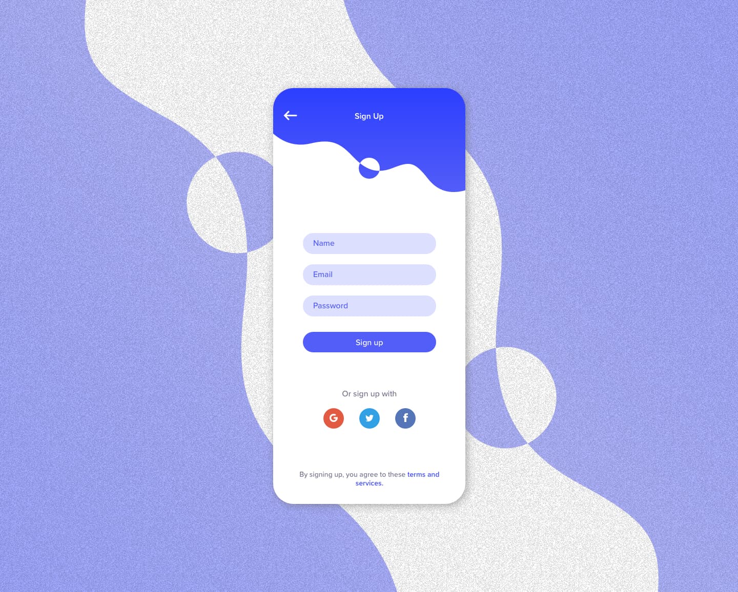
Digital Branding
The branding process facilitates meaningful connections between consumers and products by developing a visual language that resonates with a brand's ethos. These designs display aesthetic choices in line with a brand's identity.
Tracker app
The Tracker Simp designs convey web and server analytics through visual differentiation and interactivity. Visitor trends are distinguished by color, with peaks in blue for desktop and red for mobile, mirroring the ebb and flow of web traffic. Server statuses are presented in a streamlined table, where each entry is marked with metadata, allowing instant insight into system operations much like a financial ledger in a banking app.
Payment app
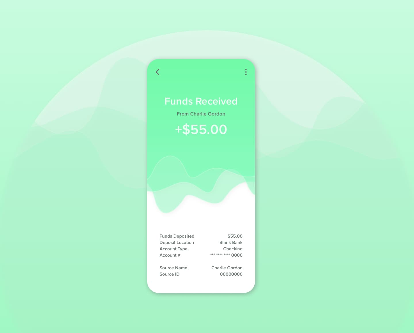
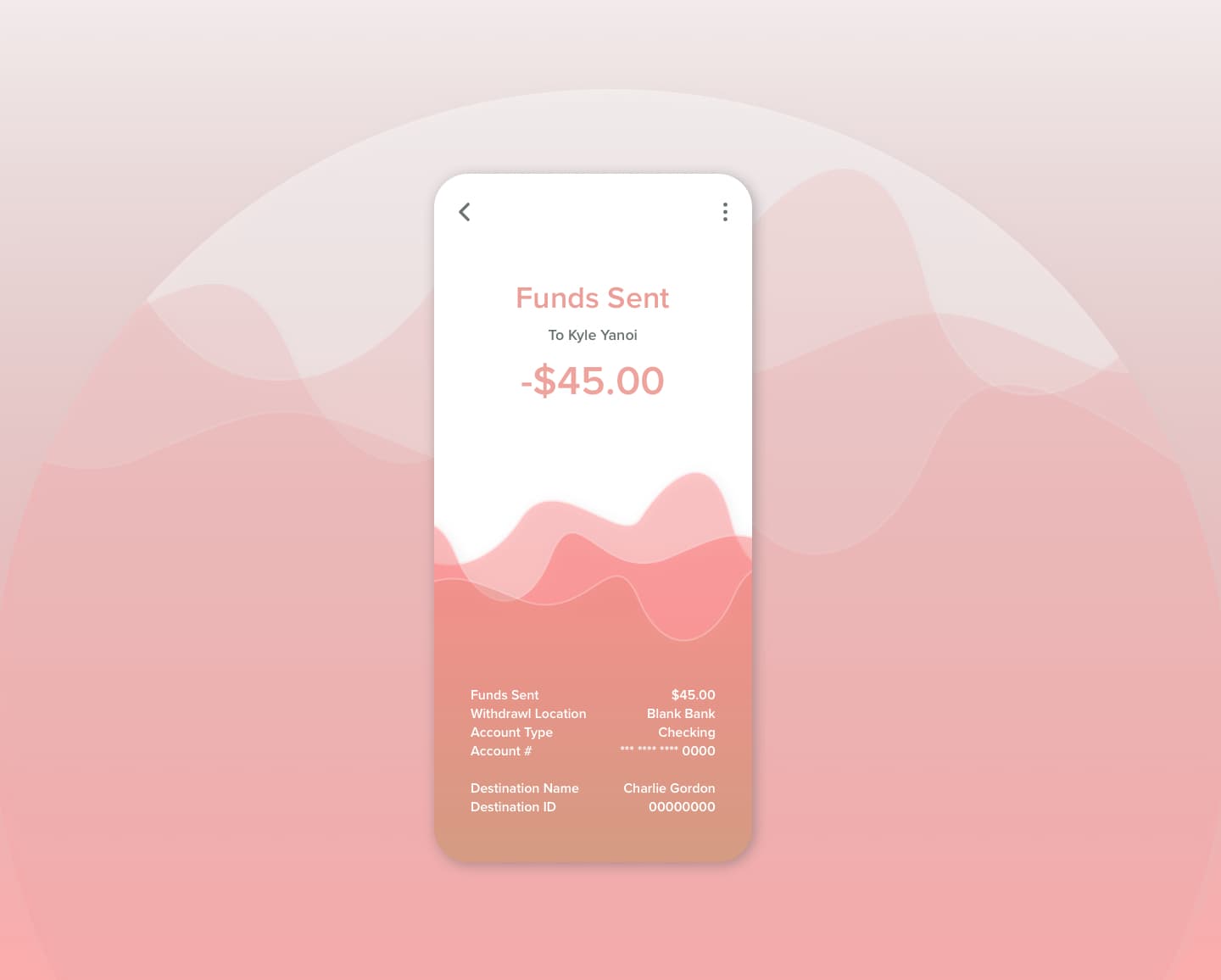
These payment app designs aim to communicate transferring money by relating it to fluid motion and color. When the user receives money, the top half of the screen shows green to indicate the gain. When the user pays someone, the opposite is shown in red to communicate the loss.
Plant care app
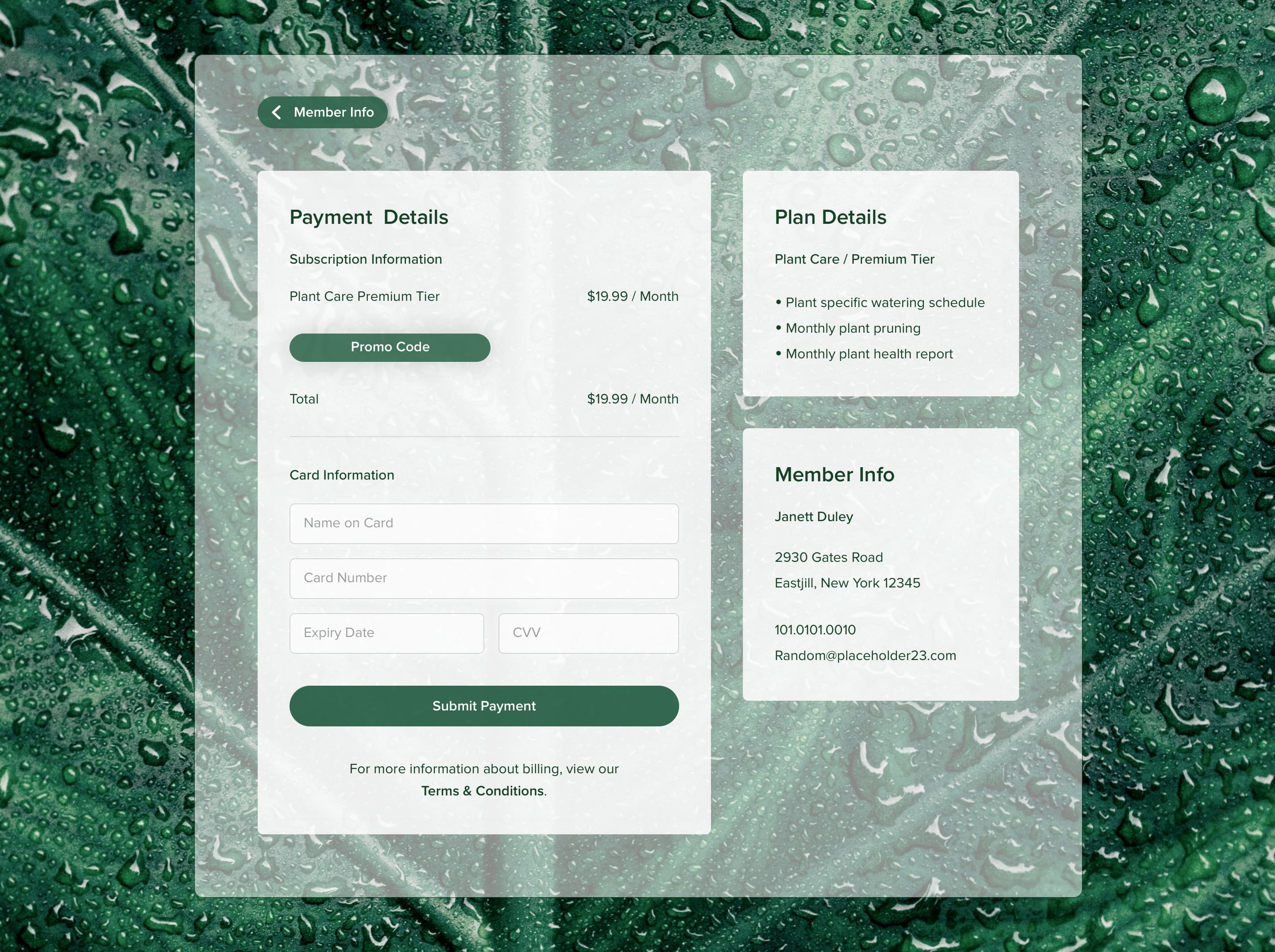
This payment submission screen aims to reduce a user's payment reluctance by displaying visuals related to the brand's offered service subscription.
Typographic assets
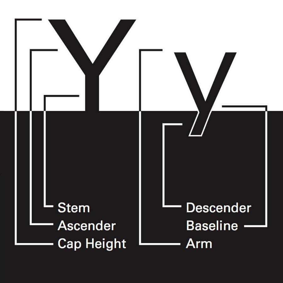
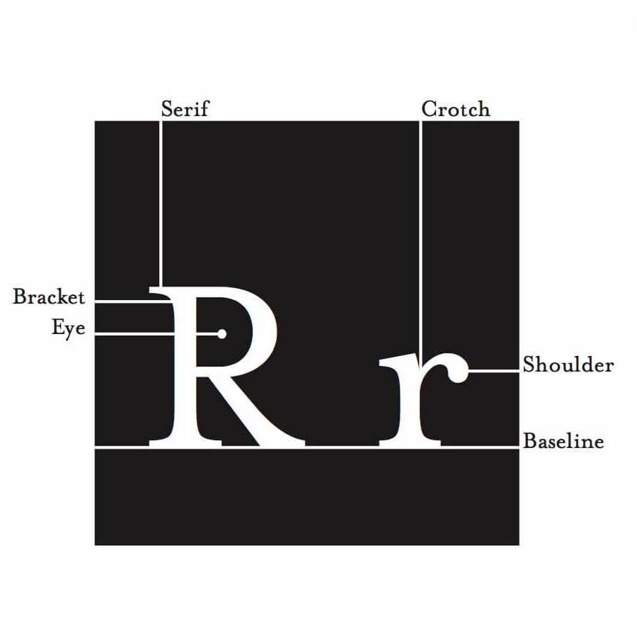
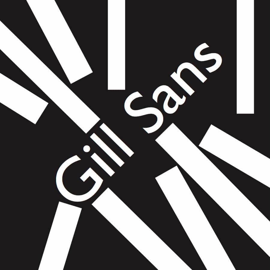
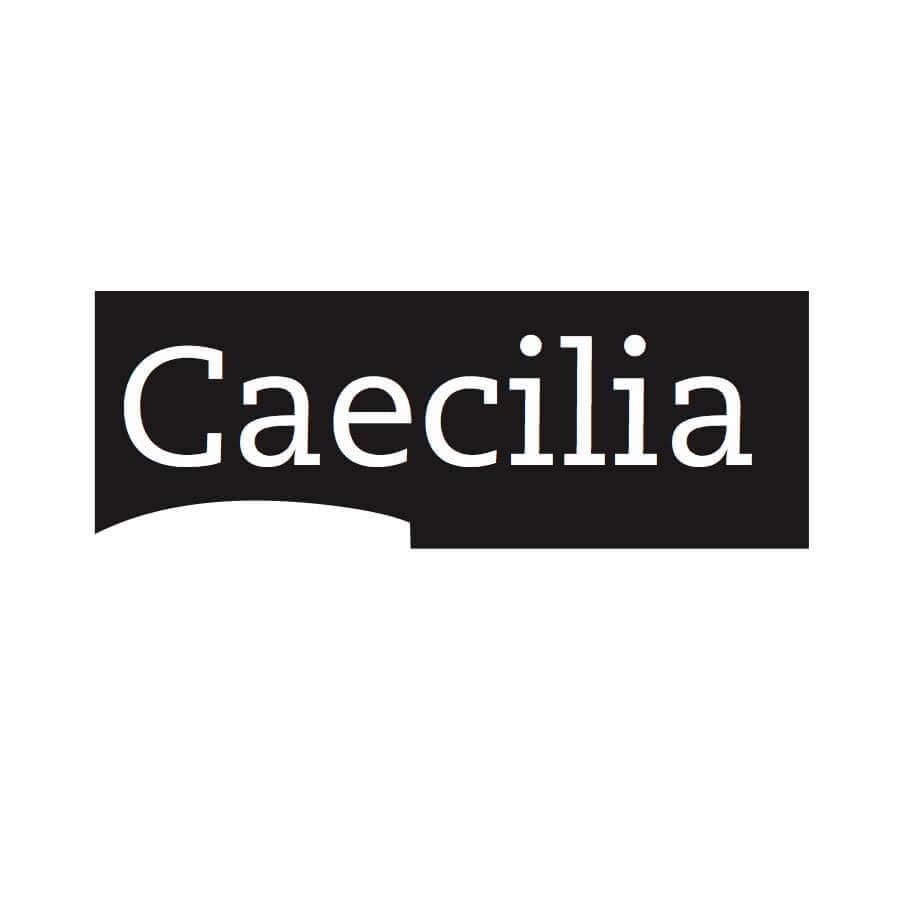
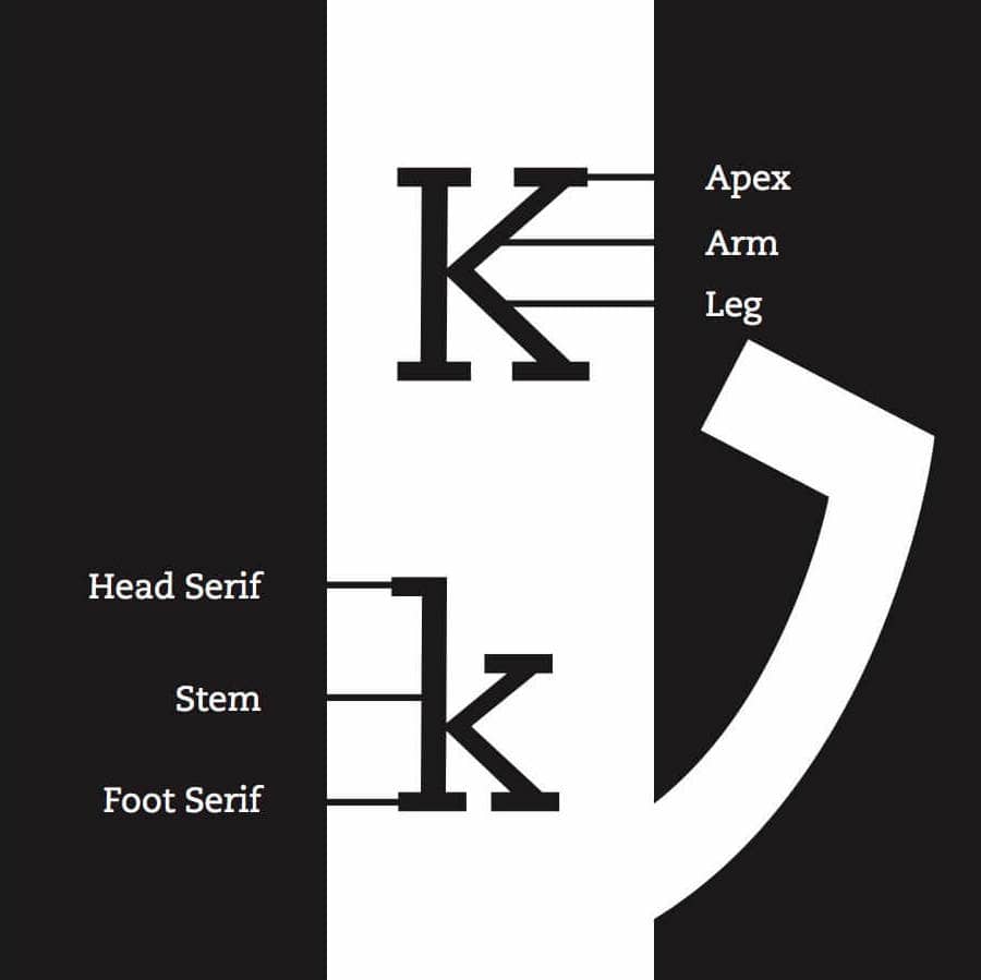
These typographic-based images use the form of various typefaces to highlight the illustrative nature of text forms to harmonize with a text-related brand.




Mobile sign-up
